CSS Styling
CSS styling encompasses the art and science of enhancing the visual aesthetics and layout of web pages through Cascading Style Sheets (CSS). This vital technology allows web developers to define the design and formatting rules that browsers apply to HTML elements, thereby influencing critical visual aspects such as colors, fonts, spacing, and overall layout. As the web evolves, CSS styling has become increasingly crucial for creating responsive designs that adapt seamlessly to various devices and screen sizes. Concepts such as responsive web design techniques and CSS frameworks have gained significant popularity, facilitating the development of visually appealing and user-friendly websites. Recently, advancements in CSS, including features like CSS Grid and Container Queries, have improved design flexibility and responsiveness. These innovations allow for layouts to adjust dynamically based on both viewport dimensions and parent container sizes, enabling the creation of modular design systems. Additionally, CSS Variables and new approaches to typography, such as Variable Fonts, have emerged, offering greater ease in styling management and more dynamic visual options. With features like Scroll Snap Behavior for smoother navigation and Cascade Layers for streamlined stylesheet organization, modern CSS simplifies the development process. As developers increasingly leverage these capabilities, the ongoing evolution of CSS continues to empower web aesthetics and functionality, making it an indispensable tool in the landscape of web development.
What are the essential concepts of HTML and CSS that beginners should focus on when starting web development?
When starting web development, beginners should first learn HTML, the standard markup language that structures web pages using tags and attributes. The most crucial aspect is understanding semantic layout—using the right elements (header, main, footer) in appropriate places to create proper structure. With CSS, focus on the box model (margin, padding, borders, content), layout techniques like Flexbox and CSS Grid for positioning content, and responsive design to ensure websites look good across all devices. After mastering these fundamentals, practice by creating projects like landing pages to reinforce learning and apply these concepts practically.
Watch clip answer (02:00m)
Traversy Media
05:13 - 07:14
What is the best approach to becoming a Full Stack Web Developer in 2025 with AI integration?
The ideal approach combines traditional syntax learning with AI-assisted project building. Developers should first master HTML for structure, CSS for styling, and JavaScript for interactivity as foundational skills. However, rather than spending months solely on syntax, they should simultaneously build projects using AI tools. This parallel learning method allows beginners to prompt AI in plain English to create code while reverse-engineering the results to understand why certain tags, properties, or JavaScript concepts were used. This combination of traditional learning and AI collaboration creates "100x developers" who can build functional projects efficiently while developing a deeper understanding of the code through practical application.
Watch clip answer (03:23m)
TAP ACADEMY
02:21 - 05:44
What are the essential technologies needed to build a basic website?
The essential technologies for building a basic website begin with HTML, the standard markup language that structures web pages through tags and attributes. CSS complements HTML by providing styling capabilities through selectors and properties. Together, they form the foundation of web development, with HTML serving as the skeleton and CSS adding visual styling. Git version control is recommended for tracking changes and collaborating with others, while platforms like GitHub store code repositories. For deployment, services like Vercel or Netlify allow you to make sites accessible online, and purchasing a custom domain name adds professionalism to your website.
Watch clip answer (05:09m)Traversy Media
05:13 - 10:23
How do you create a responsive HTML email template that works on both desktop and mobile devices?
A responsive HTML email template requires specific coding techniques to work across devices. You need to use internal styles and inline CSS while making tables with 100% width and fixed maximum widths (600px is standard). The key is implementing breakpoints that allow content to shift from multi-column layouts on desktop to single-column layouts on mobile. In the tutorial, this is accomplished using table structures with column classes that respond to screen size. This responsive approach ensures all content remains readable and properly formatted whether viewed in Gmail on desktop or in email apps on mobile phones.
Watch clip answer (12:40m)
w3newbie
00:00 - 12:41
What are the key elements and formatting techniques used in creating a responsive HTML email template?
When creating responsive HTML email templates, developers still use XHTML 1.0 transitional doctype for maximum compatibility across email clients. The structure relies on table elements with strategic formatting - outer wrapper tables center the content and maintain structure, while inner tables control layout. Key techniques include setting width to 100% with maximum width of 600px, using table-layout-fixed, adding border-spacing:0, and implementing font-family:sans-serif styling. These elements ensure the email displays properly across devices while maintaining proper spacing and formatting.
Watch clip answer (08:15m)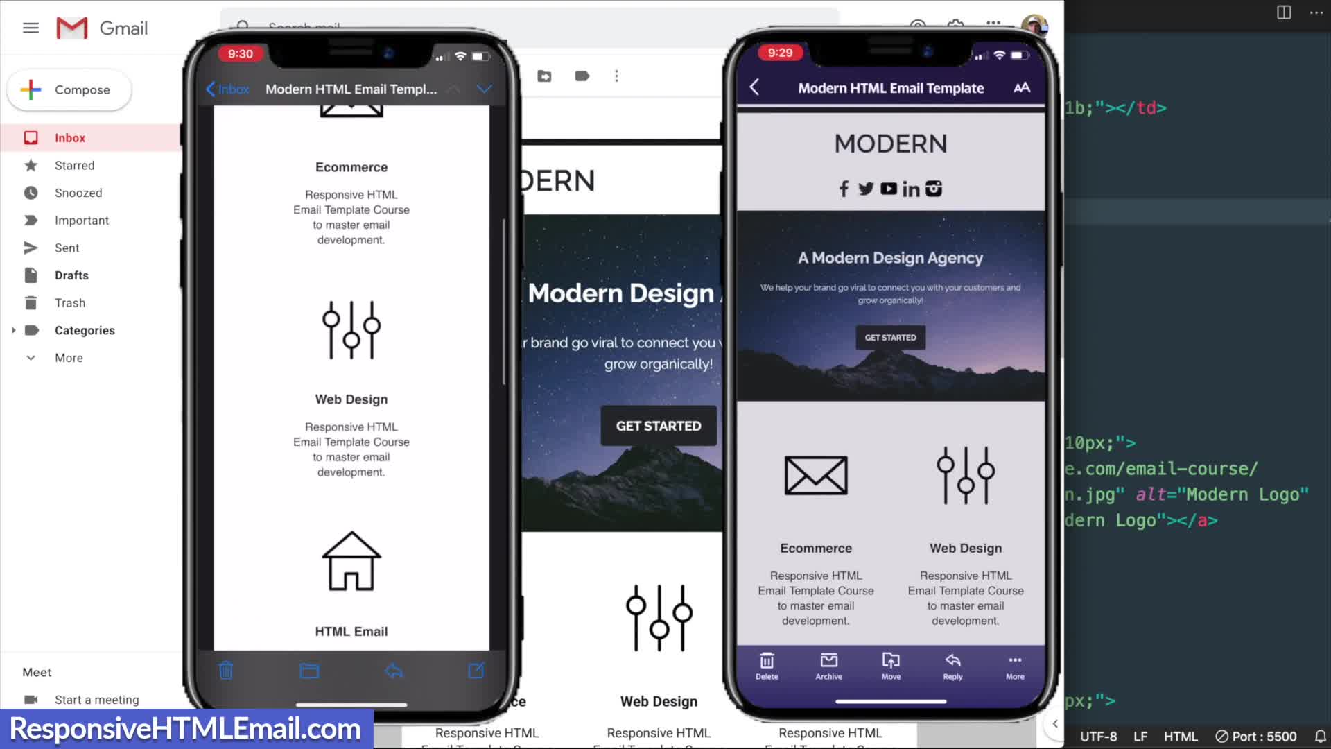
Responsive HTML Email
02:06 - 10:22
How do you style text in an HTML email template?
In HTML email templates, text can be styled using various tags and CSS properties. You can use the strong tag for bold text or alternatively a span tag with font-weight: bold. Color can be applied using hex values (like #289DCF for blue). Text size is controlled with font-size property (e.g., 20px or 15px), and spacing can be managed with line-height (e.g., 23px) and padding. For alignment, text-align: center can be applied to parent elements like table data cells. These styling techniques help create visually appealing, readable content that works across different email clients.
Watch clip answer (02:20m)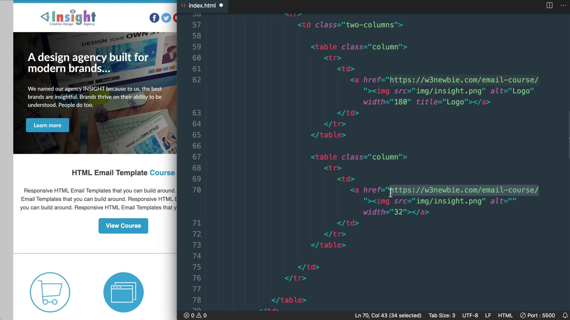
w3newbie
19:42 - 22:02