CSS Styling
CSS styling encompasses the art and science of enhancing the visual aesthetics and layout of web pages through Cascading Style Sheets (CSS). This vital technology allows web developers to define the design and formatting rules that browsers apply to HTML elements, thereby influencing critical visual aspects such as colors, fonts, spacing, and overall layout. As the web evolves, CSS styling has become increasingly crucial for creating responsive designs that adapt seamlessly to various devices and screen sizes. Concepts such as responsive web design techniques and CSS frameworks have gained significant popularity, facilitating the development of visually appealing and user-friendly websites. Recently, advancements in CSS, including features like CSS Grid and Container Queries, have improved design flexibility and responsiveness. These innovations allow for layouts to adjust dynamically based on both viewport dimensions and parent container sizes, enabling the creation of modular design systems. Additionally, CSS Variables and new approaches to typography, such as Variable Fonts, have emerged, offering greater ease in styling management and more dynamic visual options. With features like Scroll Snap Behavior for smoother navigation and Cascade Layers for streamlined stylesheet organization, modern CSS simplifies the development process. As developers increasingly leverage these capabilities, the ongoing evolution of CSS continues to empower web aesthetics and functionality, making it an indispensable tool in the landscape of web development.
What are the bonus resources included with the HTML email template tutorial?
The tutorial includes nine bonus templates and an email signature alongside the main tutorial project. The template being developed is based on the "modern HTML email template" from the course bonuses. The instructor mentions that these resources are available as part of the course, and also provides additional resources on their website, including a Visual Studio Code lesson that covers basics, recommended extensions, and settings for email development work.
Watch clip answer (08:15m)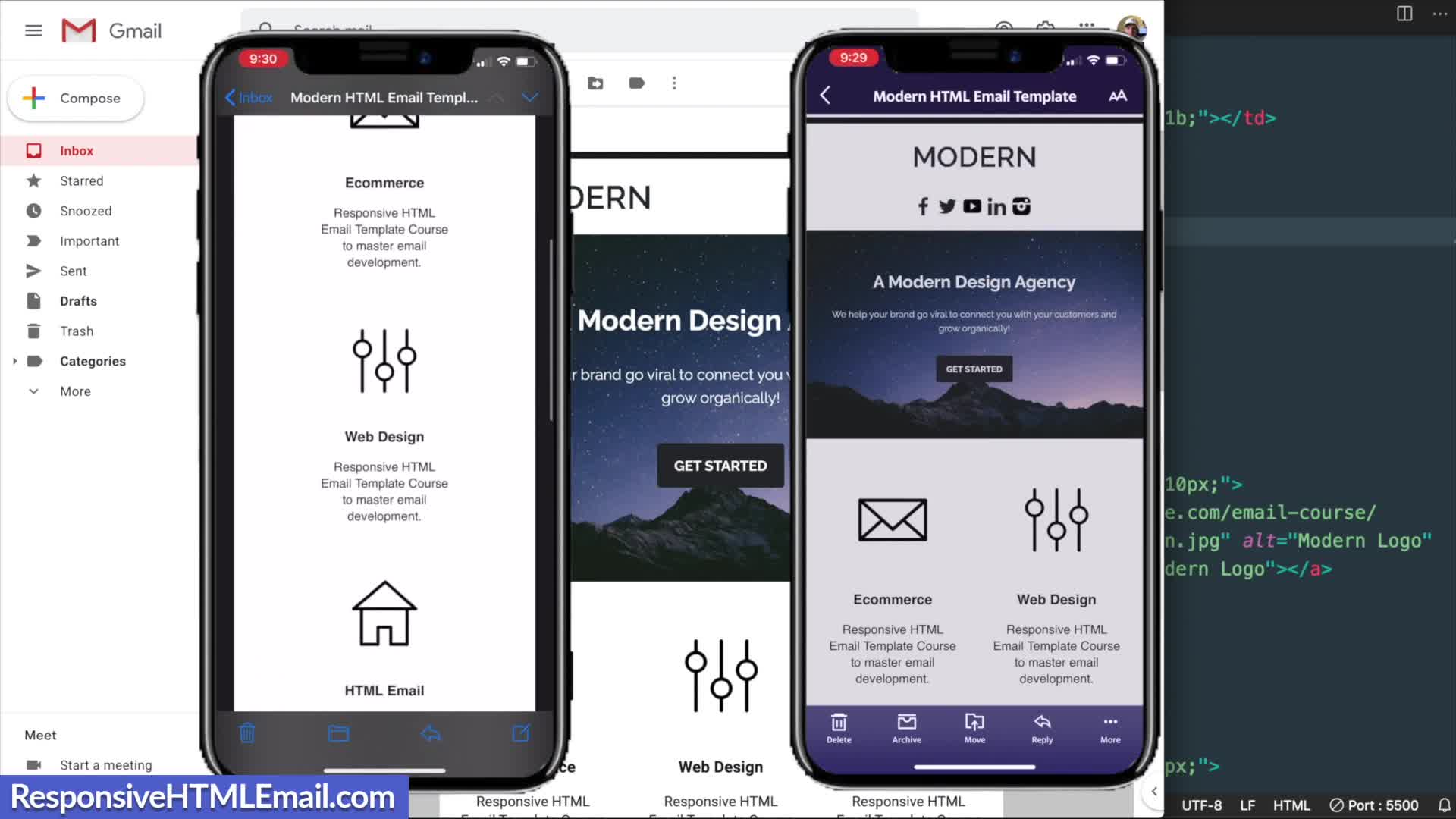
Responsive HTML Email
02:06 - 10:22
What are the key HTML structures needed to create a responsive email template?
The key HTML structures for responsive email templates include using XHTML 1.0 transitional as the document type for maximum client compatibility, along with proper meta tags for character sets and mobile device rendering. The template structure requires a center tag for alignment (despite being deprecated in HTML5), containing a main table with width=100% and max-width=600px. For columns that need to reflow on mobile, a 'two columns' class is used. All styling should maintain table-layout-fixed properties, with border-spacing:0 to prevent unwanted gaps between elements across email clients.
Watch clip answer (10:31m)Responsive HTML Email
02:06 - 12:38