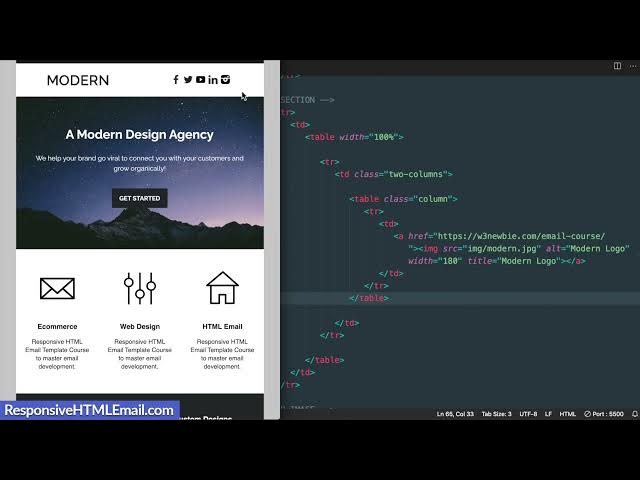
What are the key elements and formatting techniques used in creating a responsive HTML email template?
When creating responsive HTML email templates, developers still use XHTML 1.0 transitional doctype for maximum compatibility across email clients. The structure relies on table elements with strategic formatting - outer wrapper tables center the content and maintain structure, while inner tables control layout. Key techniques include setting width to 100% with maximum width of 600px, using table-layout-fixed, adding border-spacing:0, and implementing font-family:sans-serif styling. These elements ensure the email displays properly across devices while maintaining proper spacing and formatting.
 Clipped by ProMLGgamer with FinalLayer
People also ask
TRANSCRIPT
Load full transcript
0

From
Building an Email Template: A Comprehensive Tutorial on HTML Email Design
Responsive HTML Email·6 months ago
Answered in this video

What bonus templates are included in the HTML email course tutorial?
What can you expect to learn from the HTML email template course and what additional resources are included?
Discover the right B-roll for your videos


