Data Visualization
Data visualization is the practice of transforming raw data into visual representations, such as charts, graphs, maps, and dashboards, to facilitate understanding and effective communication. In today's data-driven world, this technique is crucial for identifying patterns, trends, and insights within complex datasets, making it easier for decision-makers across various sectors, including business, healthcare, and finance, to derive actionable insights. The ability to visualize data greatly enhances comprehension, allowing stakeholders to analyze and interpret large volumes of information quickly and effectively. The importance of data visualization cannot be overstated, as it serves as a critical tool for reporting and analyzing key performance indicators (KPIs) and other vital metrics. By employing interactive charts and well-designed dashboards, organizations can ensure that even non-technical users can engage with and understand complex insights. Emerging technologies, including Artificial Intelligence (AI), are transforming data visualization by automating the creation of sophisticated, personalized visuals tailored to user preferences. This evolution is set to democratize data access, enabling more people to derive insights through user-friendly, dynamic visualizations. Furthermore, the integration of immersive technologies like augmented reality (AR) and virtual reality (VR) will further enhance the visualization landscape—allowing users to explore complex data relationships in ways traditional visualizations cannot achieve. As businesses seek rapid, informed decision-making, mastering data visualization skills has become increasingly essential in the modern workplace.
How do you connect Google Analytics data to Power BI?
Power BI offers a built-in Google Analytics connector that makes the connection process straightforward. First, go to 'Get data' and click 'More', then search for 'Google Analytics' in the data connectors dialog box. After selecting the connector and clicking 'Connect', you'll need to sign into your Google Analytics account via a web browser authentication process. Once signed in, Power BI will display your website data in a cube format, allowing you to select metrics like page views, entrances, and exits. You can then load this data into your model or transform it further using Power Query Editor for any necessary data cleaning.
Watch clip answer (03:03m)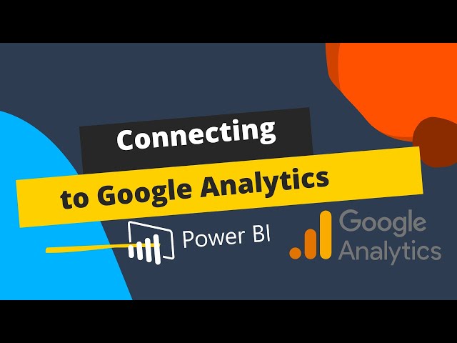
Go Analytics
00:01 - 03:04
What are the top embedded analytics tools and their key strengths?
The video highlights four leading embedded analytics tools with their distinct strengths. Qlik Sense excels in customizable integrations with an open-source library that facilitates integrations across environments and automation options for data lifecycle management. Microsoft Power BI stands out for security and compliance, offering business-focused cybersecurity features including user authentication against Azure ID. Looker, a Google Cloud product, specializes in data modeling with capabilities to track changes and review database history while seamlessly integrating with data pipelines. Finally, Tableau leads in data visualization with drag-and-drop functionality for creating visualizations for web pages, portals, and external-facing applications.
Watch clip answer (01:31m)
TechnologyAdvice
00:59 - 02:31
What are the key features and benefits of Python in Excel?
Python in Excel integrates directly into the Excel environment through the new PY function, requiring no installation. Users can leverage popular Python libraries like Pandas and matplotlib within their Excel workbooks to create visualizations, train machine learning models, and perform advanced analytics. The system runs securely in Microsoft Cloud as a compliant Microsoft 365 service, protecting data privacy. This integration works seamlessly with Excel's native features including formulas, charts, pivot tables, and conditional formatting, combining Excel's flexibility with Python's analytical power to enhance data-driven decision making and storytelling.
Watch clip answer (01:25m)
Microsoft 365
00:02 - 01:27
How can Gemini 2.5 Pro transform static content into interactive visualizations?
Gemini 2.5 Pro can transform static content into interactive visualizations through several methods. Users can upload research papers or images and convert them into colorful, interactive dashboards using the Canvas tool, as demonstrated with the AI clinical practice dashboard example. The interface enables creating responsive elements that highlight when clicked. Additionally, Gemini offers tools like the Video to Learning app, which can transform YouTube videos into interactive learning experiences that organize content into structured formats. Users can also create custom visualizations from text prompts alone, as shown with the startup journey visualization, all without writing code. These features make complex information more engaging and accessible.
Watch clip answer (04:26m)
AI and Tech for Education
00:56 - 05:23
What are pivot tables and why are they important in Excel?
Pivot tables are one of Excel's most powerful features that allow users to extract significance from large, detailed data sets. They help transform raw data into meaningful insights by summarizing information like employee data, total hours, and patient metrics. What makes pivot tables especially valuable is their ability to automatically update when the source data changes. This live updating feature extends to any charts created from the pivot table, ensuring all visualizations stay current without manual intervention. This dynamic connection between source data, pivot tables, and charts creates an efficient workflow for data analysis in Excel.
Watch clip answer (07:14m)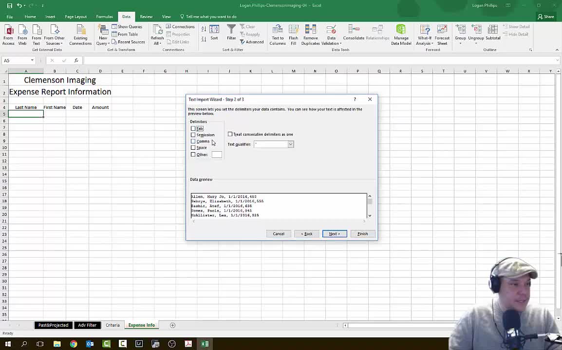
Logan Phillips
25:06 - 32:20
How can multiple visualizations be organized in Tableau?
In Tableau, multiple visualizations can be organized by grouping them together into a cohesive dashboard. The speaker demonstrates this by working with four different visualizations, first labeling one as "enrollment total" and then planning to group all four visuals together for a more comprehensive view. This grouping feature allows users to combine related visualizations into a single display, making it easier for viewers to see connections between different data points. By organizing multiple charts and graphs together, Tableau enables more effective data storytelling and helps highlight important insights that might not be apparent when viewing visualizations separately.
Watch clip answer (00:17m)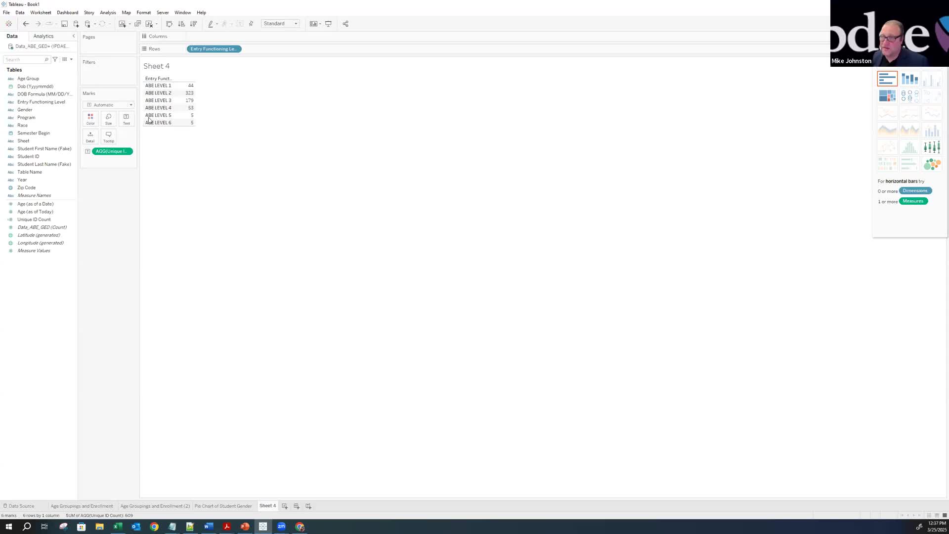
IPDAE
40:31 - 40:48