Data Storytelling
Data storytelling is the art of transforming complex data into engaging narratives that drive informed decision-making and foster a deeper understanding of insights. Unlike traditional data presentations that often rely on dry statistics and intricate dashboards, effective data storytelling integrates narrative techniques with visuals to create compelling and memorable stories. This approach not only enhances comprehension but also drives emotional engagement, making data more relatable and actionable for various audiences. Key components of successful data storytelling include clean, analyzed data, a structured narrative that conveys context, and visually appealing elements such as charts and infographics that support the narrative arc. In today's data-driven environment, the importance of mastering data storytelling cannot be overstated. Organizations are increasingly required to harness data not just for reporting but as a strategic communication tool that influences decision-making and stakeholder trust. As recent insights indicate, emotional connections through storytelling can facilitate more informed business strategies, making it a crucial skill for professionals across diverse fields, including business analytics, marketing, and healthcare. As tools like AI-enhanced data platforms continue to evolve, they empower data storytellers by automating insights and visualizations, allowing teams to focus on crafting impactful narratives that resonate. By integrating storytelling techniques with data visualization, businesses can build a data-literate culture that leverages insights effectively and drives meaningful change.
What LinkedIn analytics data should you pay attention to and which should you ignore?
According to LinkedIn expert Brenda Meller, you should primarily focus on profile views, as this metric shows people who actually clicked on your profile. If you have premium, you can see who these viewers are and take action. Post impressions can be periodically useful to track content performance. However, search appearances data has limited value and can often be ignored. This data only shows that you appeared in search results but doesn't indicate whether people took action by viewing your profile, making it less relevant for measuring meaningful engagement. It's similar to LinkedIn's version of a 'hidden camera trick' to keep you on the platform longer.
Watch clip answer (00:17m)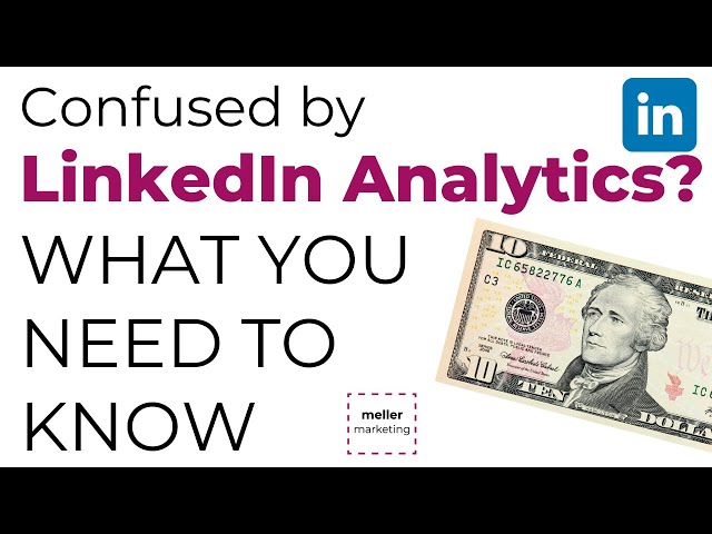
Brenda Meller | Meller Marketing 🥧LinkedIn
00:00 - 00:17
What are the key features and benefits of Python in Excel?
Python in Excel integrates directly into the Excel environment through the new PY function, requiring no installation. Users can leverage popular Python libraries like Pandas and matplotlib within their Excel workbooks to create visualizations, train machine learning models, and perform advanced analytics. The system runs securely in Microsoft Cloud as a compliant Microsoft 365 service, protecting data privacy. This integration works seamlessly with Excel's native features including formulas, charts, pivot tables, and conditional formatting, combining Excel's flexibility with Python's analytical power to enhance data-driven decision making and storytelling.
Watch clip answer (01:25m)
Microsoft 365
00:02 - 01:27
How can multiple visualizations be organized in Tableau?
In Tableau, multiple visualizations can be organized by grouping them together into a cohesive dashboard. The speaker demonstrates this by working with four different visualizations, first labeling one as "enrollment total" and then planning to group all four visuals together for a more comprehensive view. This grouping feature allows users to combine related visualizations into a single display, making it easier for viewers to see connections between different data points. By organizing multiple charts and graphs together, Tableau enables more effective data storytelling and helps highlight important insights that might not be apparent when viewing visualizations separately.
Watch clip answer (00:17m)
IPDAE
40:31 - 40:48
What are the essential skills needed to be an effective data analyst?
Effective data analysts must be comfortable with data, able to analyze it thoroughly, and possess curiosity to continually question what the data reveals. They need foundational statistical knowledge, including understanding correlations and variables, combined with technical skills like SQL, R, and Python. However, the most powerful analysts don't just present technical analysis but translate their findings into actionable insights. They connect data to business context and tell compelling stories that lead to recommendations. The value of analysis lies not in showing how it was done, but in framing insights that drive decisions—translating complex findings into clear guidance for stakeholders.
Watch clip answer (03:00m)
DataCamp
26:48 - 29:48
What are the main challenges in data visualization for businesses?
Businesses are drowning in data, but face significant challenges in visualizing it effectively. Des Traynor emphasizes that many visualizations prioritize aesthetics over clarity, resulting in confusing infographics that fail to convey meaningful information. The problem is exacerbated when executives struggle to interpret complex data displays. Traynor advocates for the principle of being 'clear first and clever second,' emphasizing that effective visualizations should prioritize user comprehension over artistic complexity. He notes that sometimes simple text is more effective than elaborate visuals, and that automated visualization tools often struggle to create adaptable, meaningful representations of data.
Watch clip answer (03:42m)
beyond tellerrand
00:33 - 04:15
What are the main challenges in data visualization according to Des Traynor?
According to Des Traynor, the main challenges in data visualization include the difficulty of making visuals that are truly useful, adaptable, and meaningful. He emphasizes that we're drowning in data and struggling to process increasing amounts of information from various sources. Despite the desire to visualize data attractively, he points out that it's hard to create computer-generated visuals that are both adaptable and worthwhile. Traynor advocates for clarity over cleverness, following the ethos that visuals must be clear first and clever second – and if something must be sacrificed, cleverness should go. He warns that poorly conceived visuals can confuse rather than clarify information.
Watch clip answer (02:53m)beyond tellerrand
00:33 - 03:26