Responsive Web Design
What resources are included in the HTML email template tutorial?
The tutorial includes several valuable resources for creating HTML email templates. In addition to the main course project, there are nine bonus templates and an email signature. The current tutorial is based on one of these bonus templates. The instructor also mentions that their website contains additional resources, including a Visual Studio Code text editor lesson that covers basics, recommended extensions, and preferred settings for email development. Starter files have been prepared for viewers to follow along with the tutorial.
Watch clip answer (06:20m)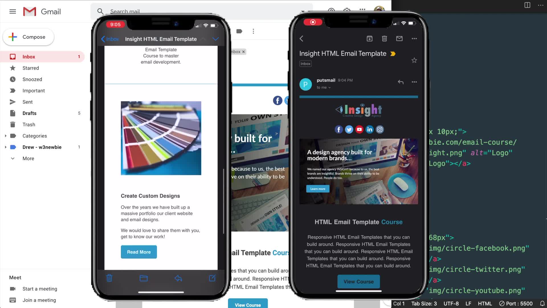
w3newbie
01:59 - 08:19
What are the bonus resources included with the HTML email template tutorial?
The tutorial includes nine bonus templates and an email signature alongside the main tutorial project. The template being developed is based on the "modern HTML email template" from the course bonuses. The instructor mentions that these resources are available as part of the course, and also provides additional resources on their website, including a Visual Studio Code lesson that covers basics, recommended extensions, and settings for email development work.
Watch clip answer (08:15m)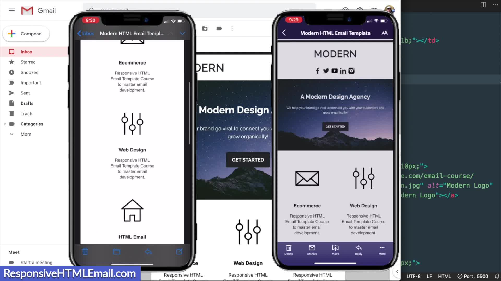
Responsive HTML Email
02:06 - 10:22
What are the key HTML structures needed to create a responsive email template?
The key HTML structures for responsive email templates include using XHTML 1.0 transitional as the document type for maximum client compatibility, along with proper meta tags for character sets and mobile device rendering. The template structure requires a center tag for alignment (despite being deprecated in HTML5), containing a main table with width=100% and max-width=600px. For columns that need to reflow on mobile, a 'two columns' class is used. All styling should maintain table-layout-fixed properties, with border-spacing:0 to prevent unwanted gaps between elements across email clients.
Watch clip answer (10:31m)Responsive HTML Email
02:06 - 12:38
What is Mobile First Indexing and how does it impact websites?
Mobile First Indexing is Google's process of using smartphone agents in their Googlebot web crawler to scan and index website content. Historically, Google used desktop versions for evaluation, but now the mobile version is considered the primary version on Google's search engine. This shift aims to provide better experiences for mobile users, who represent the majority of web traffic today. For website owners, this means ensuring equal quality across both mobile and desktop versions of their sites. Older websites need to be evaluated for mobile-friendliness, while new sites are automatically indexed with mobile priority. The change doesn't create a separate index but rather changes which version of a site Google prioritizes when evaluating content quality and relevance.
Watch clip answer (03:46m)
Agency Partner Interactive
00:11 - 03:58