

Do you know what fascinates me about old films? It is how those pioneers of cinema breathed life into black-and-white footage through chemical wizardry. (I spent countless hours in film school studying these techniques, and they still amaze me.) These craftsmen had to master complex chemical baths to manipulate mood and atmosphere, which is difficult when working without color!
Regarding color, let me tell you about the revolution that hit the cinema in the '60s. The Italians completely transformed the game with their Giallo films, these wild, surreal thrillers that popped with bold colors. They created what we now call the "Yellow style," which changed everything.
Fast forward to today, and we've traded those chemical baths for digital tools, witnessing another revolution in visual storytelling. With video content dominating everything from social media to streaming platforms, creators like you carry this rich legacy of visual manipulation.
In this guide, we'll explore the intricate world of visual enhancement through color manipulation. Indeed, we're talking about color grading, which offers an unprecedented palette of creative possibilities that puts artistic control right at our fingertips.
1. Understanding Color Grading
Color grading is a post-production process that transforms the visual aesthetics of motion pictures, digital video, and still images.
It involves the deliberate manipulation of various image/video attributes, including contrast, saturation, color temperature, black levels, and white balance, to achieve specific artistic, emotional, and narrative goals.
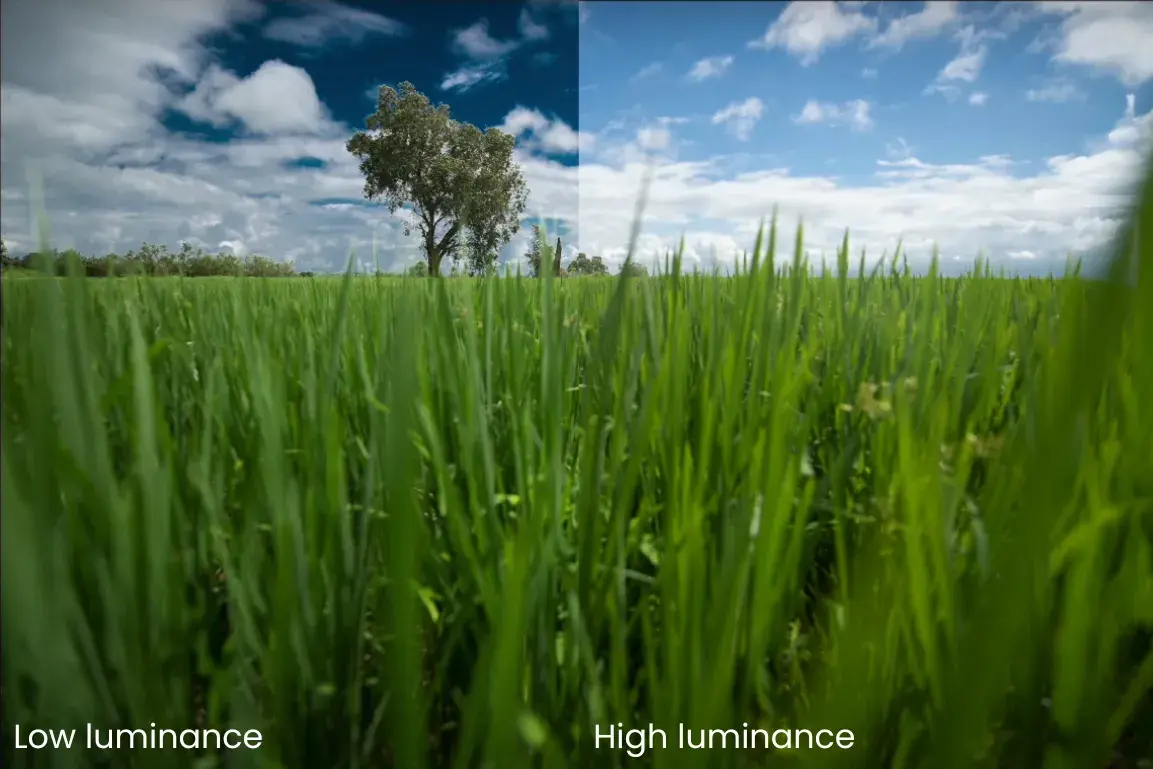
If you get it correct, it can make a cloudy day feel warm and inviting or turn a sunny afternoon into a tense, dramatic scene.
The terms color grading and color correction are frequently interchanged when describing this process, which may incorporate the creation of stylistic color effects through the strategic application and blending of multiple layer masks from the original footage( You will learn the difference between the two terms in upcoming section of the same blog).
But before we dive into the creative aspects, we need to understand the fundamental principles of color grading.
Primary and Secondary Color Grading
Primary color grading focuses on broad adjustments that affect the entire image. These adjustments include:
Overall contrast and exposure: When you tweak contrast and exposure, you are basically deciding, "How punchy do I want this to look?" High contrast makes everything pop, while exposure makes it bright or darker.
Color temperature and tint: Temperature is like adding warmth or coolness to your shot. Warm it up, and everything gets this cozy, sunset-like glow. Cool it down, and it feels more like early morning or moonlight.
Global saturation levels: Global saturation is very simple; just decide if you want your colors to shout or whisper. You can pump it up for vibrant, Instagram-worthy pics or tone it down for that moody, film-like feel.
Secondary color grading allows more precise control by targeting specific elements within your image. This includes:
Adjusting individual colors without affecting others—If you want those blue skies to look epic while leaving everything else alone, that is called individual color control.
Enhancing or muting particular areas of the frame- Suppose your subject's face is perfect, but the background is darker. Then, you can decide to brighten just the background.
Fine-tuning skin tones- Skin tones are tricky, and nobody wants their actor to look like an oompa loompa. Secondary grading lets you make people look natural while keeping your creative look everywhere else.
Creating depth through selective contrast- If you want your subjects to really stand out, you can add contrast around them, making them pop from the background.
2. Why Color Grading Matters
Here is something that amazed me: our brain processes visual information way faster than text. That is why color can hit you right in the feels before you even know what's happening (My grandma used to say that we all are color experts from birth; pretty cool, right?). Thus, color grading serves many purposes like:
Making The Story Visually Appealing
Every frame in your video tells a story, and color is one of your most powerful storytelling tools. When used thoughtfully, color grading helps convey emotions, establish settings, and guide your audience's attention.
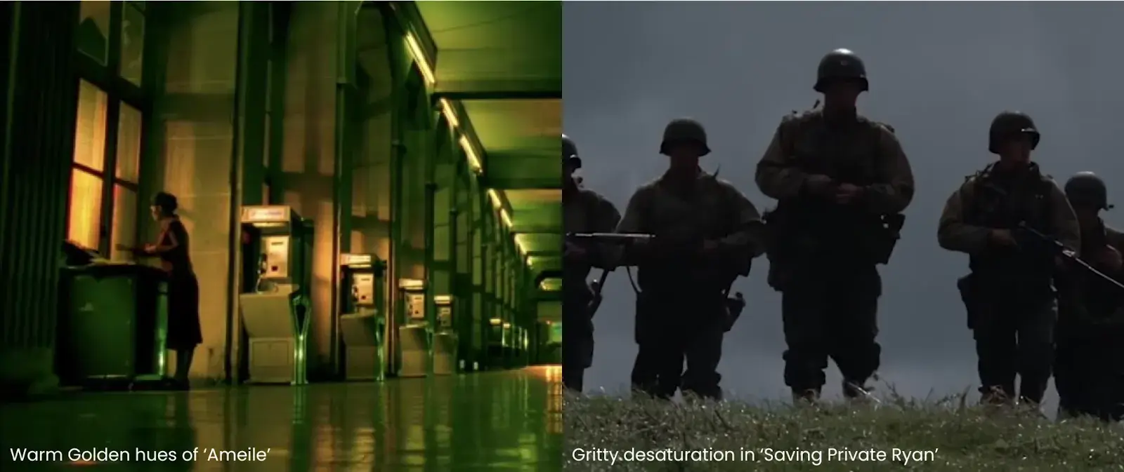
The gritty desaturation in "Saving Private Ryan" helps us feel the harsh reality of war, while the warm, golden hues in "Amélie" create a sense of whimsical romance.
Creating Consistency
Professional content needs to feel unified. Even when shooting with multiple cameras or in different lighting conditions, color grading ensures your footage feels like one cohesive piece. This consistency helps keep viewers immersed in your story rather than distracted by visual differences.
Setting the Mood
Color shapes how viewers feel about a scene before a single word is spoken. A horror film might use sickly greens to create unease, while a romantic comedy might embrace warm, flattering tones.
You can enhance these emotional cues through color grading and deepen your audience's connection to the story.
Professional Polish
In today's competitive media landscape, audiences expect a certain level of polish. Color grading helps your work meet these expectations. Whether creating content for social media, corporate videos, or feature films, proper color grading sets your work apart from amateur productions.
Supporting Your Vision
Perhaps most importantly, color grading helps bring your creative vision to life. It is the difference between capturing a scene and crafting a moment. If you nail it, you can make your story feel more authentic and impactful.
3. Understanding Color Correction vs. Color Grading: Two Steps to Beautiful Footage
The journey from raw footage to cinematic beauty involves two distinct but related processes. Many newcomers to video editing often confuse color correction with color grading. Let me break this down in a way I wish someone had explained it to me when I started.
Color Correction: Creating the Foundation
Color correction is the technical first step in post-production. It is where we fix any issues in the footage and create a clean, neutral starting point. During this process, we try to make the footage look natural and consistent, just as our eyes saw it during filming.
Here, you have to adjust exposure problems, fix white balance issues, and ensure skin tones look realistic. You have to ensure that all shots match, whether they were filmed at different times of the day or with different cameras.
When a colorist corrects footage, they essentially say, "This is how the scene actually looked in real life." It's like resetting your footage to a neutral state, where colors are true and exposure is balanced.
Color Grading: Adding Artistic Vision
Color grading takes place only after color correction is complete. This is where the artistry comes in. While color correction fixes technical issues, color grading creates the mood and atmosphere that enhances your story.
While working on grading, try to ensure that your footage looks more compelling. Colors might be enhanced or muted during the grading process to create specific emotional responses.
For example, you might make greens more vibrant in a forest scene or add a calm blue tone to a night sequence. These are some of the creative choices that support your narrative.
Understanding the Relationship
Color correction and color grading are distinct but complementary processes in video post-production. Color correction builds a house's foundation; it needs to be solid and on level before you can start decorating, while color grading is like painting the walls and choosing the furniture; it is where you add your personal style and create the atmosphere you want.
Professional colorists know you can not skip the correction phase and jump straight to grading.
Even the most beautiful color grade would not look right if the underlying footage is not adequately corrected. That is why they treat these as two distinct phases of post-production.
But always Keep in mind that you must get your basics right. Neither process can be a substitute for good cinematography. They are tools to enhance your footage but can not fix fundamental filming problems.
The best results come when you start with well-shot footage, apply careful color correction, and then use thoughtful color grading to bring your creative vision to life.
4. The Building Blocks
Recording Formats
When you record video, your camera captures it in three main ways: standard (Rec.709), Log, and Raw.
Each has its purpose and gives you different levels of control in post-production.
Standard recording gives you a ready-to-use image that looks natural from the camera. It is perfect when you need quick turnarounds or do not plan heavy color manipulation. However, it limits your ability to make significant changes later.
Log recording might look grey and lifeless initially, but do not let that discourage you. This format captures more detail in the bright and dark areas of your image. It is like having a sketch you can paint on later, giving you more creative freedom in your grade.
Raw recording is the most flexible but also the most demanding. It captures every bit of information your camera's sensor can see. While these files take up more space and require more processing power, they give you the most control over your final image.
Understanding Color Spaces
As digital cinema evolved, different color spaces emerged to serve different needs.
Rec.709 is the standard color space for HD video. Most editors work with it daily when creating content for broadcast TV, YouTube, or standard streaming. This is your bread and butter for most projects.
Rec.2020 and P3D65 are wider color spaces that modern cameras and high-end displays can handle. Though many editors shoot in these wider spaces, they often need to convert to Rec.709 for final delivery to ensure consistency across different viewing devices.
HDR has truly transformed what's possible in post-production. Beyond just being brighter, it lets editors preserve details in both the brightest highlights (like sunsets) and darkest shadows (like night scenes) that would be lost in standard dynamic range.
However, it is crucial to note that when editing HDR, you need to ensure your monitoring setup can actually display HDR accurately to make proper creative decisions.
Understanding LUTs:
LUTs (Look Up Tables) are essential tools that transform how your footage looks, working like recipes for color transformation. At their core, LUTs are mathematical tables that take existing color values and transform them into new ones, allowing for controlled modifications of your video's appearance. When working with footage shot in RAW or Log formats, which intentionally look flat and desaturated, LUTs become your first step in bringing life back to your images.
In the color grading world, we work with two main types of LUTs.
Technical LUTs, also called Input LUTs, handle the crucial task of converting your camera's footage into a standard color space like Rec.709.
Every major camera manufacturer provides their own specific LUTs—Sony has them for S-Log, Canon for C-Log, and so on. These LUTs ensure your footage has a proper starting point for creative work.
Creative LUTs, on the other hand, come into play after your initial color correction. These help you achieve specific artistic looks, from emulating classic film stocks to creating contemporary styles like the popular orange-teal contrast seen in Hollywood blockbusters.
They can enhance various aspects of your image simultaneously, adjusting saturation, modifying contrast, and transforming specific colors to achieve your desired look.
The flexibility of LUTs is one of their greatest strengths. In most editing software, you can apply LUTs at multiple levels: to individual clips, entire tracks, specific events, or even your final output. This hierarchical application gives you precise control over your color grading process.
You can also fine-tune the intensity of any LUT by adjusting its strength, allowing you to blend between the original and processed image to find the perfect balance.
LUTs are tools to help you achieve your vision, not magical solutions that instantly perfect your footage. They work best as part of a thoughtful color grading process, complementing your creative decisions rather than replacing them.
5. The Art of Color in Visual Storytelling: More Than Just Pretty Pictures
Cinematic Color Grading: The Technical Foundation
At its core, cinematic color grading is the art of manipulating raw footage to achieve consistent color tones throughout your visual narrative. This technical process goes beyond simple adjustments. It is about crafting a unified visual language that serves your story.
In modern production, color grading serves multiple critical functions like:
- It creates consistency across footage from different cameras, making diverse sources appear as if captured with the same device
- It establishes and maintains your project's specific visual profile through precise control of color, saturation, and tone
- It ensures technical accuracy, particularly in skin tones, through professional tools like vectorscopes (crucial for main characters, beneficial even for background elements when resources permit)
- Transforms raw footage into a cohesive visual experience by manipulating contrast, color, and saturation to match scenes shot under varying conditions
Modern productions, from feature films to digital content, employ contrast-based grading to create visually compelling and emotionally resonant experiences.
This technical approach allows creators to use color spaces strategically, conveying specific emotions or foreshadowing key moments within their narrative.
The process typically begins in pre-production, where directors and production designers establish the initial color palette. This early planning ensures that the final color grading process enhances rather than reconstructs your intended visual narrative.
Color Palettes: Your Film's Visual DNA
Color palettes work like a painter's chosen colors—they set the tone for the entire piece.
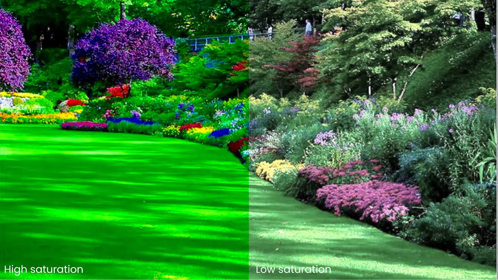
Most of the top content creators develop their distinctive looks—whether it is Peter McKinnon's moody contrasts or Casey Neistat's high-energy saturation—and they are building their visual brand through intentional color choices. For example, In this video of Casey Neistat, high saturation is used:
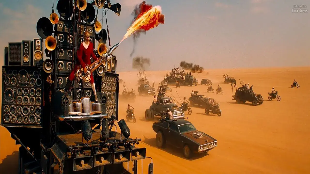
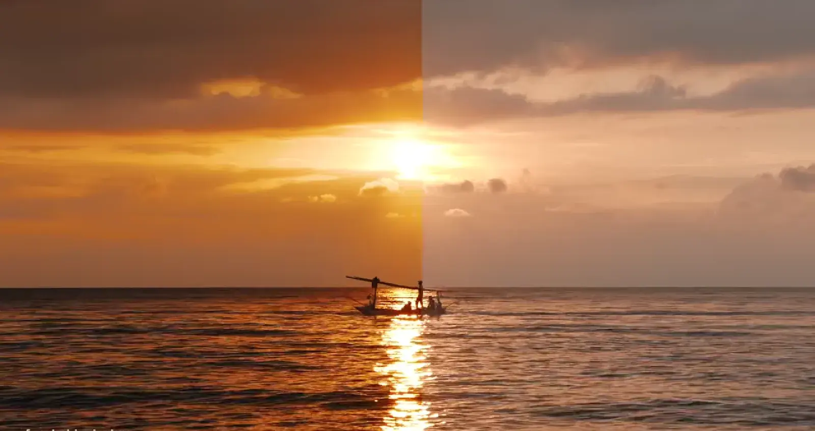
Take "Mad Max: Fury Road" and modern travel content. The film's orange-teal palette is not a random choice—it represents a brutal world with moments of hope.
Travel creators adopt this same principle, using warm, vibrant oranges of sunset shots against cool teals of ocean scenes to craft their stories of adventure and discovery.
How Different Genres Speak Through Color
Each genre has developed its own color language:
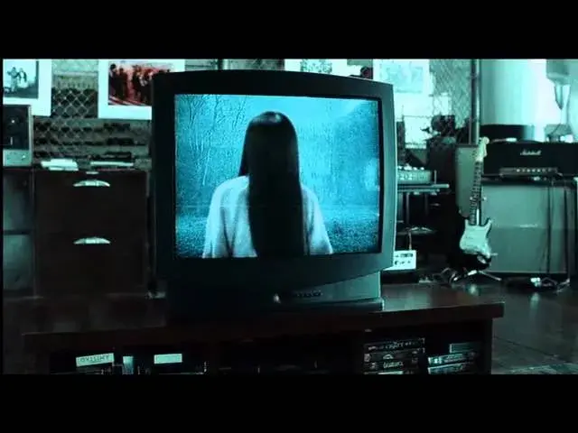
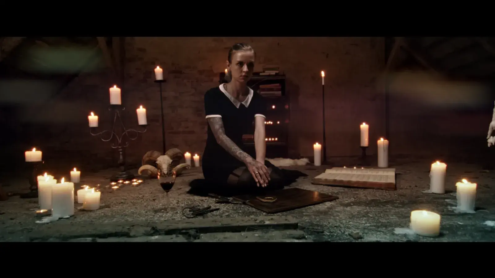
Horror films and thriller content often embrace shadowy greens and sickly yellows. While "The Ring" uses a green-blue palette to make daylight unsettling, modern true crime YouTubers adopt similar techniques to create tension in their documentary-style videos.
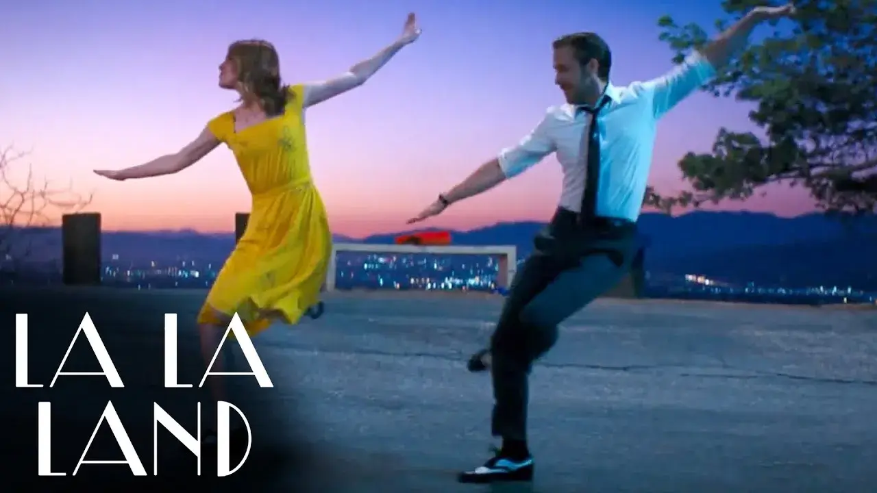
Drama and lifestyle content gravitate toward natural, inviting colors. Notice how "La La Land" uses bright, optimistic colors similar to how successful vloggers enhance their daily life footage to make ordinary moments feel extraordinary.
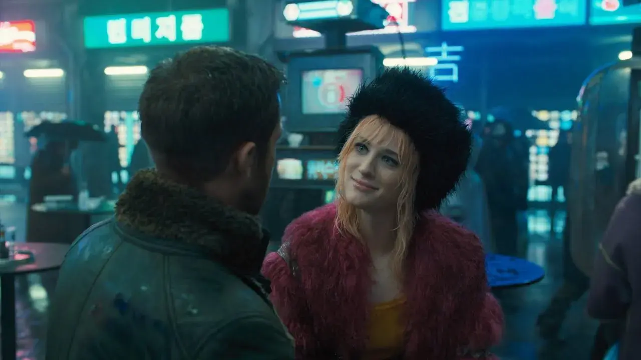
Science fiction and tech content create distinct visual worlds. "Blade Runner 2049" uses stark oranges and cool blues, while tech reviewers adapt these high-contrast principles to make their product reviews visually striking and professional.
Building your Story's Color Identity Whether you're a filmmaker or content creator, planning your color palette before shooting is crucial. When David Fincher desaturates his films or when cinematic YouTubers craft their signature looks, they're adding layers of meaning to every frame. The principles transfer seamlessly—it's about using color to enhance your narrative.
Building Your Story's Color Identity
Whether you're a filmmaker or content creator, planning your color palette before shooting is crucial. When David Fincher desaturates his films or Barry Jenkins bathes "Moonlight" in distinct shades of blue, or when cinematic YouTubers craft their signature looks, they're adding layers of meaning to every frame.
The real art lies in making these choices feel natural. Great color work just seeps into the viewer's consciousness, helping them feel what the characters feel without knowing why.
Making Colors Work Together
Today's digital tools give us incredible control over color, but the principles remain the same as in the chemical processing days. Whether you are working on a feature film or a short video, your color choices should be:
- Support your story's emotional journey
- Create visual consistency across scenes
- Guide viewer attention
- Enhance the mood of each sequence
Every color choice in cinema is a storytelling choice. When we understand this, color grading becomes more than a technical process—it becomes another tool in our storytelling arsenal. Emotional beats while maintaining their fundamental character.
6. Three Distinct Approaches to Color Grading
The world of color grading offers endless creative possibilities, but most work falls into three main approaches, each serving different storytelling needs.
Naturalistic Color Grading
Naturalistic color grading aims to enhance reality without drawing attention to itself. For example, documentaries like "Planet Earth II," where colors are refined to showcase nature's true beauty.
The grade subtly brings out the deep greens of rainforests or the rich blues of oceans while maintaining the authenticity of what we see in real life.
This approach demands a delicate touch—enough enhancement to captivate viewers but not so much that it feels artificial.
Stylized Color Grading
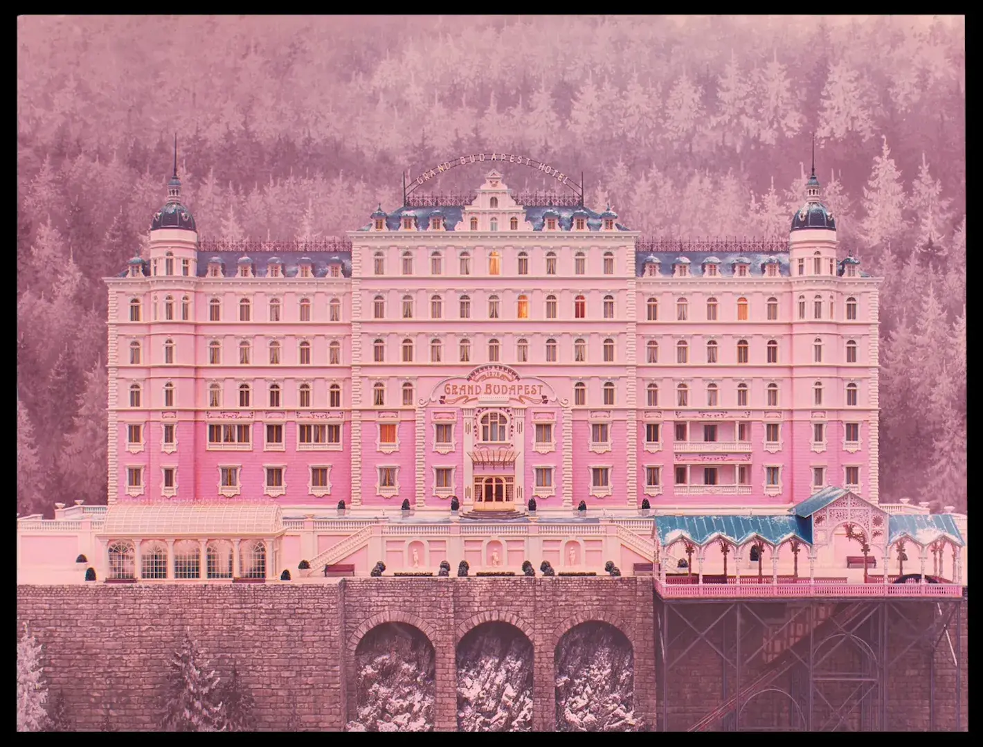
This approach pushes creative boundaries to create distinct visual styles. Films like "The Grand Budapest Hotel" use bold, stylized grades to create unique worlds.
Here, colors do not need to reflect reality; they serve the story's emotional and thematic needs. A stylized grade might exaggerate certain colors while muting others, creating a specific mood or atmosphere that becomes part of the narrative itself.
Genre-Specific Color Grading
Different genres have developed their own color languages over time.
Horror films often employ desaturated, cool tones to create unease, while romantic comedies typically use warm, inviting colors. Action films might emphasize contrast and saturation for impact, while period dramas often use muted palettes to evoke specific eras.
These established approaches help audiences instantly understand the type of story they're watching.
Understanding these three approaches gives you a foundation to develop your own style.
While you might start by working within these established frameworks, the most memorable work often comes from knowing when to follow conventions and when to break them creatively.
7. A Beginner's Guide to Color Grading: Making Your Vision Come to Life
Color grading might initially seem overwhelming, but breaking it down into steps makes it manageable. Let me walk you through how professionals approach the color grading process.
Starting with Color Correction
Before adding any creative looks, we must ensure our footage has a solid foundation. Color correction is like preparing a canvas before painting. Focus on getting your exposure right, balancing your whites, and ensuring your footage looks clean and natural. Your highlights shouldn't be blown out, and your shadows should retain detail.
Finding Your Color Match
This is where science meets art. Using LUTs (Look Up Tables) can help establish a consistent color scheme across your project. LUTs act as recipes for color; they help you achieve specific looks consistently. There are many modern editing software that come with built-in LUTs, giving you a great starting point.
Making Your Shots Play Together
Nothing breaks immersion like shots that don't match. Even if you used different cameras or shot at different times of day, your audience should never notice these technical differences. Pay special attention to matching shots within scenes, as consistency is key.
Getting Skin Tones Right
Our eyes are incredibly sensitive to skin tones. We instinctively know when they look wrong. Use your vectorscope (a tool showing where your colors fall) to ensure skin tones remain natural and consistent throughout your project. This is especially crucial for your main characters, who appear frequently on screen.
Creating the Mood
Now comes the creative part. This is where you enhance your story through color. Want a scene to feel warm and inviting? Push toward golden tones. Need tension? Perhaps a cooler, desaturated look works better. Let your story guide these choices - every color decision should support your narrative.
The Final Touch
Color grading should enhance your footage, not try to save it. It acts like seasoning a well-cooked meal, which brings out the best in what is already there. During your final pass:
- Check that your colors align with your initial vision
- Ensure consistency across all scenes
- Make sure your adjustments feel natural
- Don't overdo it; subtle changes often work best
Remember, great color grading feels invisible. Your audience should not notice the grade itself; they should just feel what you want them to feel. Take your time with each step, and do not be afraid to step away and come back with fresh eyes.
8. Tools of Color Grading
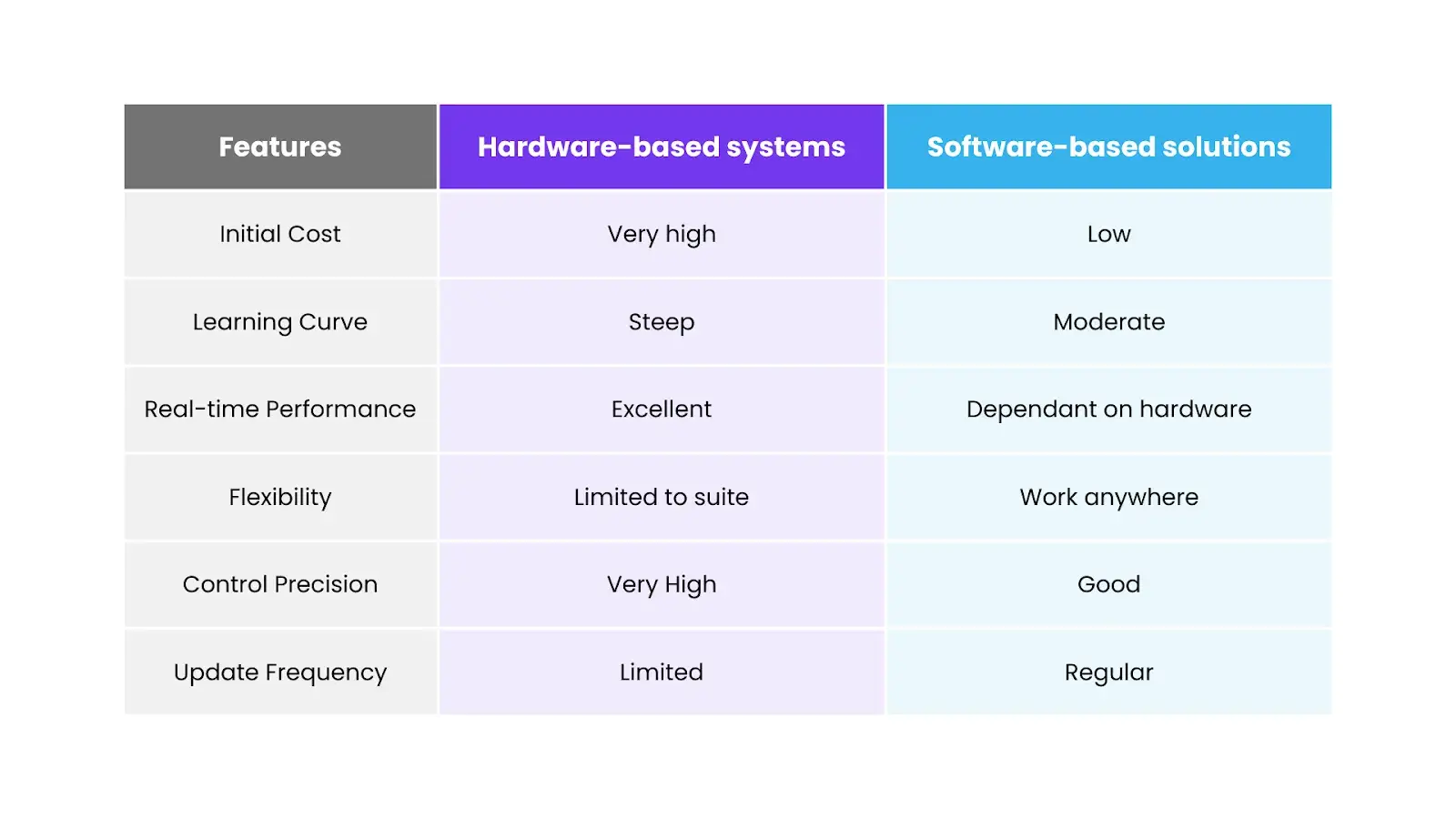
Hardware-Based Color Grading
Professional color grading suites traditionally relied on dedicated hardware systems. They are like massive control panels with countless knobs and buttons, professional reference monitors, and specialized processing units. Major film studios still use these systems for their unmatched precision and real-time performance.
Software-Based Color Grading
The digital revolution has transformed color grading through robust software solutions. There are some key considerations which you should keep in mind when choosing software:
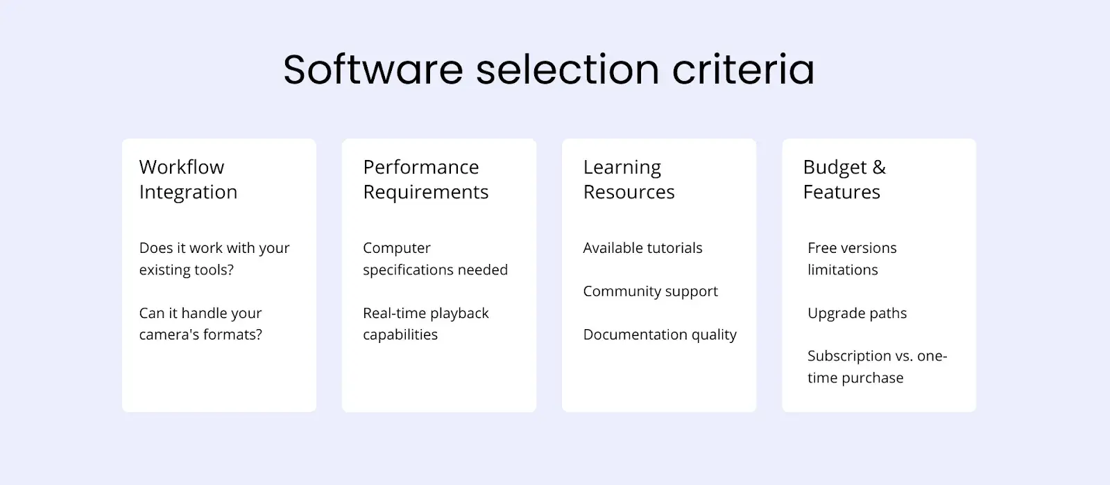
Hardware vs. Software
Let's explore how hardware & software affect and serve colorists' needs.
9. Advanced Color Grading: Beyond the Basics
The real magic of color grading often happens when we start using advanced techniques. Let's explore some powerful tools that can take your grading to the next level.
Power of Power Windows and Motion Tracking
Power windows and motion tracking let you isolate and adjust specific parts of your image while following moving subjects.
Power windows are more like spotlights that only affect specific areas of your frame. You might use them to:
- Brighten an actor's face in a backlit scene
- Enhance the color of a specific object
- Darken distracting background elements
But subjects move, and that's where motion tracking comes in. Many modern software can automatically track your power windows, keeping them locked to moving subjects. It is like having an invisible assistant who keeps your adjustments perfectly placed frame by frame.
Secondary Color Correction
Sometimes, you need to adjust one color without affecting others. Maybe you want to make a red dress pop without changing skin tones or deepen the sky's blue without affecting the rest of your scene.
Secondary color correction lets you target specific colors or tones.
Hue is your color selector—working on a 360° wheel, it lets you target specific colors like a sky's blue or skin tones with surgical precision.
Saturation manages color intensity, from subtle to vivid, which is crucial for keeping skin tones natural and making specific elements pop.
Luminance controls the brightness of selected colors independently, letting you enhance depth and dimension without affecting color purity.
Together, these three components enable precise adjustments that are impossible with primary correction alone. You can select precise color ranges and adjust only the specific colors while keeping other colors untouched.
Working with Masks and Keys
The most sophisticated color work often combines multiple techniques:
- Luminance keys to separate highlights from shadows
- Gradient masks for subtle transitions
- Compound nodes that combine different adjustments
These tools give you incredible control but remember—the goal is to serve your story better.
10. Professional consideration
Working with Clients
One of the most significant changes in modern color grading is client interaction.
In the film days, color timing was often done without the client present due to technical limitations. Now, clients can watch the process in real-time and provide immediate feedback.
This requires new skills beyond just technical and artistic ability.
We need to understand client needs, communicate effectively about color, and know when to push for what the project needs versus when to accommodate specific requests.
Maintaining Quality
Today's biggest challenge is not often technical, maintaining quality under tight deadlines. Unlike the film era, in which processing took a set amount of time, digital workflows can be rushed.
However, quality color grading still needs time and attention.
A good rule is to step away from your grade periodically. Fresh eyes often spot issues that tired ones miss.
It's also helpful to check your work on different screens - what looks perfect on your calibrated monitor might need adjustment for everyday viewing.
Special Situations
Sometimes, we face unique challenges. Such as archival footage might need restoration along with grading.
Stock footage might need to be matched with original material.
Visual effects shots require special handling to maintain consistency while supporting the visual story.
Each situation requires its approach, but the fundamental principles remain the same: serve the story, maintain technical quality, and create a coherent visual experience.
Delivering Your Work
The final stage of color grading is delivery.
Modern projects often need multiple versions: HDR and SDR, various color spaces for different platforms, and different resolutions.
Understanding how to preserve your creative intent across these formats is crucial.
Final Thoughts
The journey of color grading—from chemical baths to digital workstations—shows us how far we've come in the art of visual storytelling. Today's tools give us incredible control over our images, but the fundamental goal remains unchanged: enhancing stories through color.
Excellent color grading works invisibly. It pulls viewers into the story without drawing attention to itself. It's felt rather than noticed. A perfectly graded scene should make audiences feel something without them realizing why.
Whether you're grading your first project or your hundredth, these principles will serve you well. The tools will change, but the art of using color to move people will always be at the heart of what we do.
Keep creating, keep learning, and most importantly, keep telling stories through color.


